
Can you help me by explaining the code of roc curve in detail. the codelines
Hi Soumyadeep,
Can you please post a screenshot of the code lines you are confused about?
Regards
rom sklearn.metrics import roc_curve
y_scores_1 = y_scores[:,1]
fpr, tpr, thresholds = roc_curve(y_train_5, y_scores)
def plot_roc_curve(fpr, tpr, label=None):
plt.figure(figsize=(18,5))
plt.plot(fpr, tpr, linewidth=2, label=label)
plt.plot([0, 1], [0, 1], ‘k–’)
plt.axis([0, 1, 0, 1])
plt.xlabel(‘False Positive Rate’)
plt.ylabel(‘True Positive Rate’)
plot_roc_curve(fpr, tpr)
plt.show()
Hi Soumyadeep,
First of all let’s define the ROC Curve:
The receiver operating characteristic (ROC) curve is a common tool used
with binary classifiers. It is very similar to the precision/recall curve, but instead
of plotting precision versus recall,
the ROC curve plots the true positive rate
(another name for recall) against the false positive rate.
In other words,the ROC curve is one of the methods for visualizing classification quality, which shows the dependency between TPR (True Positive Rate) and FPR (False Positive Rate).
Here are the relationships stating the same along with the confusion matrix just to be precise:
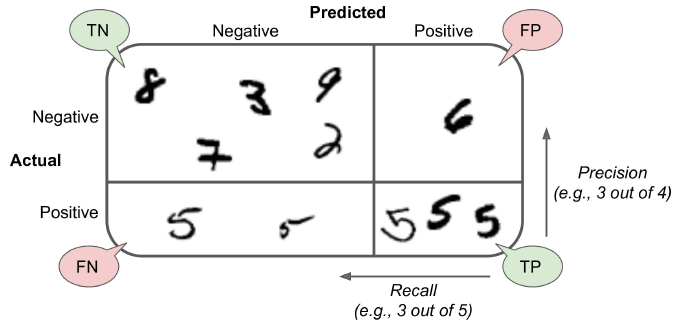
True - Positive means the classifier correctly classified the Positive class.
True - Negative means the classifier correctly classified the Negative class.
False - Positive means the classifier incorrectly classified a Negative class as Positive Class.
False - Negative means the classifier incorrectly classified a Positive class as Negative Class
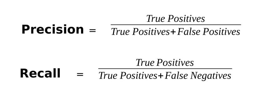
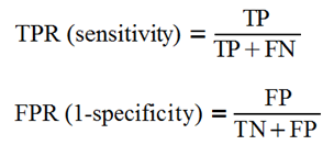
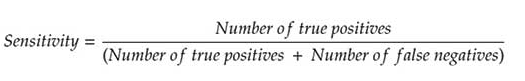
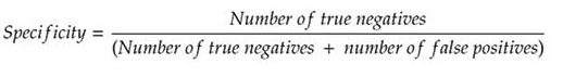
The FPR is the ratio of negative instances that are incorrectly classified as positive.
It is equal to one minus the true negative rate, which is the ratio of negative instances that are
correctly classified as negative. The TNR is also called specificity. Hence the
ROC curve plots sensitivity (recall) versus 1 – specificity.
To plot the ROC curve, we first need to compute the TPR and FPR for various
threshold values, using the roc_curve() function
Now, the code you wrote defines a function to plot the FPR against the TPR using Matplotlib. Its just plotting things for us with the dimensions and the labels. You can see the plt code in almost each line giving us:
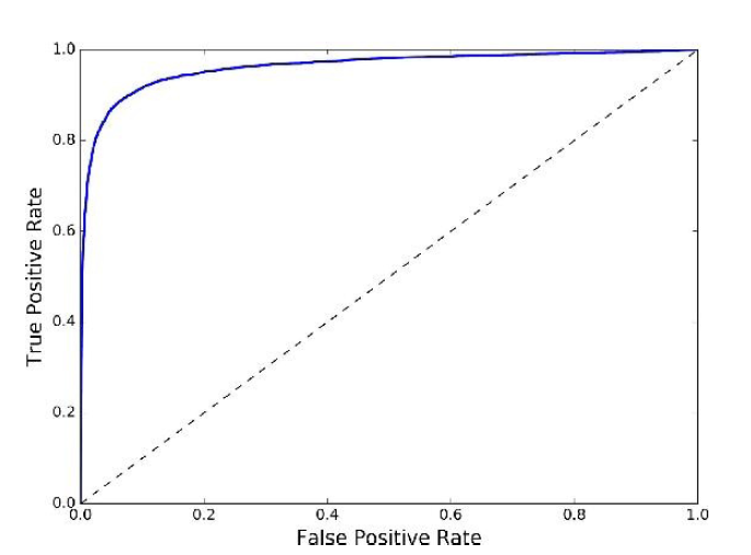
The values denoted are the result of the findings that we got with the prior codes, and this graph is the visualization for the same.
there is a tradeoff: the higher the recall (TPR), the more false
positives (FPR) the classifier produces.
The dotted line represents the ROC curve of a purely random classifier; a good classifier stays as far away from that line as possible (toward the top-left corner).
I hope it helps.
Regards