Session 9 13-Jan-2018 Q&A data visualization matplotlib seaborn heatmap

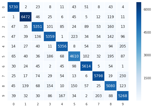
I thought I’d create this post to share my knowledge and complete my answer to the question from Kamal in today’s session. So, to show a breakdown of .annotate method from matplotlib.pyplot library to clarify further my answer that I posted in the chat today for Machine Learning course (13th Jan 2018 session):

import matplotlib.pyplot as plt
plt.annotate(s = “Five”, xy=(5,5), xytext=(2,5), color = ‘red’, arrowprops=dict(facecolor=‘red’))

Following is a breakdown of the above arguments only as the annotate method has many arguments which you can go and see by saying help(plt.annotate):

s is the text label you want to display as a string (you can just have the string as the first argument without s= in front)
xy= tuple with xycoordinates of the point you are labelling
xytext = tuple with xycoordinates where the text label will appear
color = the font color of the text label
arrowprops is used to draw an arrow pointing from the xytext (position of label) to xy (the point you are referencing).
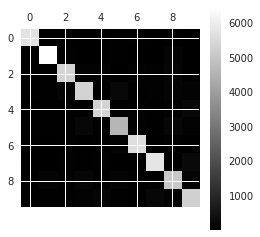
arrowprops has various properties which are passed to it as a dictionary. I used the facecolor property to make the red arrow as our confusion matrix image was greyscale. Red will make it stand out. Same logic behind making the text color red.

For more resources on learning data visualisation:

  • I highly recommend the Python data visualisation courses on DataCamp which go through matplotlib, seaborn and bokeh. This is where I learnt about this annotate method
  • Also below: is a link to some cheat sheets I posted earlier which has matplotlib cheat sheet.
    Machine Learning Python library cheat sheets - see matplotlib cheat sheet in this post
2 Likes

Hey @Gopi_Raga,

While I did learn something interesting from what you shared, this is not what I was asking.

My concern is that it is a little difficult to distinguish the slight differences of darkness. Those which are completely black can be distinguished from the grey ones but between two partially grey, it is a little difficult to distinguish the difference.

Is there a way by which, in each of the diagnol boxes, a number (may be a percentage) can be added which gives a sense as to how much dark it is?

@Kamal_Upadhyay Oh I see. You’re referring to a values on a heatmap. Yes I would find that useful too but that is where matplotlib reaches its limits. At the moment, we could use a colorbar in matplotlib to help with differentiating the shades:
Try adding plt.colorbar() before plt.show()

Seaborn can do it better:
http://seaborn.pydata.org/examples/heatmap_annotation.html

Again the DataCamp course I mentioned covers seaborn which will guide you in this.

With Matplotlib only:

plt.matshow(conf_mx, cmap=plt.cm.gray)
plt.colorbar()
plt.show()

image

With Matplotlib and Seaborn:

import seaborn as sns
sns.set()
f, ax = plt.subplots(figsize=(9, 6))
sns.heatmap(conf_mx, annot=True, fmt=“d”, linewidths=.5, ax=ax, cmap=plt.cm.Blues)

image

This is cool.

BTW, why have you pasted images… can you paste the actual code.

I would like to then print this grid excluding the diagonal high values, so that the bigger ones among the remaining are visually highlighted.

1 Like

@Kamal_Upadhyay Sorry I didnt realise I copied it all as image. I’ve separated the code now.
It’s super awesome

@Kamal_Upadhyay How would you exclude the diagonal high values?

Just add one line

np.fill_diagonal(conf_mx, 0)
import seaborn as sns
sns.set()
f, ax = plt.subplots(figsize=(9, 6))
sns.heatmap(conf_mx, annot=True, fmt=“d”, linewidths=.5, ax=ax, cmap=plt.cm.Blues)

I first tried doing it in the latter block, like this:

row_sums = conf_mx.sum(axis=1, keepdims=True)
norm_conf_mx = conf_mx / row_sums
np.fill_diagonal(norm_conf_mx, 0)
#plt.matshow(norm_conf_mx, cmap=plt.cm.gray)
#plt.show()
sns.heatmap(norm_conf_mx, annot=True, fmt="f", linewidths=.5, ax=ax, cmap=plt.cm.Blues)

But it does not show the graph, just gives this:

<matplotlib.axes._subplots.AxesSubplot at 0x7f3288712ba8>
<matplotlib.figure.Figure at 0x7f3287976588>

Not sure why.

:frowning:

1 Like

there are 3 issues with your code.

  1. You commented out plt.show. You need to uncomment it and bring it to the end of your code block. Seaborn is not independent of matplotlib. They work together. So i think that is partly my fault. I may have given the wrong impression that seaborn will show visualizations independent of matplotlib. I think of matplotlib on its own as plain HTML and matplotlib combined with seaborn as rich HTML. It’s worth reading this to give you a overview of what seaborn is and its capabilities: https://seaborn.pydata.org/introduction.html
    Why bring plt.show to the end of the code block? Generally best practice and makes sense to put it after your plotting setup commands.

  2. You need to add the sns.set() command to enable seaborn theme (default is darkgrid) http://seaborn.pydata.org/tutorial/aesthetics.html#seaborn-figure-styles.

  3. After normalisation, the integers (fmt=“d”) changed to floats. With floats, you need to specify the decimal places. So instead of “f”, you can use fmt=".2f" denoting 2 decimal point floating number. I used 3 decimal places .3f and changed the figure size from 9,6 to 12,8 to cater for the additional decimal places.
    https://stackoverflow.com/questions/31087613/heat-map-seaborn-fmt-d-error

Here is my code:

#normalised confusion matrix then plot resulting matrix as an image using simple pyplot.matshow
row_sums = conf_mx.sum(axis=1, keepdims=True)
norm_conf_mx = conf_mx / row_sums
np.fill_diagonal(norm_conf_mx, 0)
plt.matshow(norm_conf_mx, cmap=plt.cm.gray)
#Heatmap coding of normalised confusion matrix using seaborn overlay
sns.set()
f, ax = plt.subplots(figsize=(12, 8))
sns.heatmap(norm_conf_mx, annot=True, fmt=".3f", linewidths=.5, ax=ax, cmap=plt.cm.gray)
#Show all plots
plt.show()

Output:
image

image

1 Like

Can you help me understand how was this printing the graph then? I have not called plt.show(), but it does show!

import seaborn as sns
sns.set()
f, ax = plt.subplots(figsize=(9, 6))
sns.heatmap(conf_mx, annot=True, fmt=“d”, linewidths=.5, ax=ax, cmap=plt.cm.Blues)

I played around a little and figured out the culprit was this

f, ax = plt.subplots(figsize=(9, 6))

This code works exactly as desired :

f, ax = plt.subplots(figsize=(9, 6))
row_sums = conf_mx.sum(axis=1, keepdims=True)
norm_conf_mx = conf_mx / row_sums
np.fill_diagonal(norm_conf_mx, 0)
#plt.matshow(norm_conf_mx, cmap=plt.cm.gray)
sns.heatmap(norm_conf_mx, annot=True, fmt=“0.2f”, linewidths=.5, ax=ax, cmap=plt.cm.Blues)
#plt.show()

When the first line is commented, it just says

<matplotlib.axes._subplots.AxesSubplot at 0x7f36d22d3da0>
<matplotlib.figure.Figure at 0x7f36d20e2e10>

I am guessing this is because otherwise axis is set as null, help(sns.heatmap) says:

This is an Axes-level function and will draw the heatmap into the
currently-active Axes if none is provided to the ax argument.
ax : matplotlib Axes, optional
Axes in which to draw the plot, otherwise use the currently-active
Axes.

But I still do not clearly understand how it works. I did glance through the links you shared.

Looks like this an exception to the rule. I did some research (https://matplotlib.org/examples/pylab_examples/subplots_demo.html). plt.subplots plots a grid and creates the figures in one call. So I bolded the text in my quote of your code.
You correctly pointed out that seaborn was able to plot it in the above case without plt.show as the matplotlib axes were passed to the axes parameter of the seaborn heatmap.

What I also found out is that the ax parameter of heatmap is optional and will use matplotlib axes by default if none is provided. This means it depends on matplotlib.pyplot being imported.

Try this:

import seaborn as sns
sns.set()

#f, ax = plt.subplots(figsize=(9, 6))
sns.heatmap(conf_mx, annot=True, fmt=“d”, linewidths=.5, cmap=plt.cm.Blues)
#plt.show()

So, there is still a dependency on matplotlib. Seaborn is just a better visual overlay with also extra built-in plot styles to visualise more complex data structures easily. As you can see, the seaborn heatmap overlay on matplotlib axes gave better visualisation than the base matrix plot using matplotlib alone.

If you are interested in understanding Seaborn, I strongly recommend you do the DataCamp course on data visualisation, you will understand Seaborn structure better. If I had not done it, I think I would have also have trouble trying to understand how the code works with seaborn at a base level. With all the various custom parameters in seaborn, the library is too huge to cover in one course. It still covers a lot and enough for you to be able to use the commonly used features. There is a lot of subtle things like what I have learnt just by discussing with you today. As with any large programming language, it is not practical and feasible for every nitty gritty detail to be covered in an educational course. As long as the fundamental mandatory parameters of the structure is taught, you self-learn the rest by experimenting and using the library documentation.

1 Like

When you comment out the first line, there is no other command that has been run for it to display a figure like subplots or plt.show.

1 Like

Totally agree to you @Gopi_Raga.

Appreciate your enthusiasm and help.

1 Like

@Gopi_Raga, All, came across this in Kaggle:

https://www.kaggle.com/learn/data-visualisation

This does give a little background and covers Seaborn to some extent.