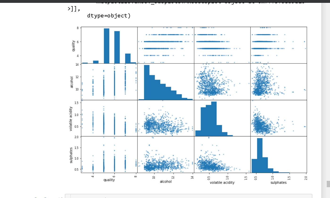
In this i am finding the correlation and alcohol is the highest correlated but after plotting the scatter plot it is showing weird type of graph as below .

In this i am finding the correlation and alcohol is the highest correlated but after plotting the scatter plot it is showing weird type of graph as below .