
What are the types of charts used in data science in order to visualize the data, and why do we use them?
Hello,
Representing data in graph, chart, and another visual format to communicate the relationship of data with an image is called Data visualization. We humans can easily and quickly process visual information.
The visual summary of data and its insight makes it easier to identify patterns and trends than looking through thousands of rows on a spreadsheet.
Data visualization makes communication of our analysis and findings effective. Without a visual representation of the insights, it can be hard for the audience to grasp the true meaning of the findings.
For example: presenting your analysis and insights without visual representation, can be hard for the audience to grasp the true meaning of those findings. Telling the numbers to the audience who doesn’t care about data but quick results such as how much money these insights could save them. Surely that will gain their attention.
Let’s discuss the type of Visualization and its uses:
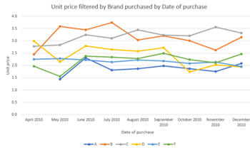
1) Line Chart: It helps us to know trends or illustrates changes in data over time.
Example:
• Stock price fluctuation over time
• Changes in website page views of months
• Sales fluctuation over the years
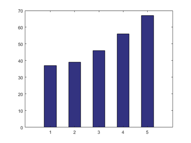
2) Bar graph: It helps in comparing data across categories, for each variable at each moment in time.
Examples:
• Comparison of sales within different departments over time
• Comparison of cricket scores between players
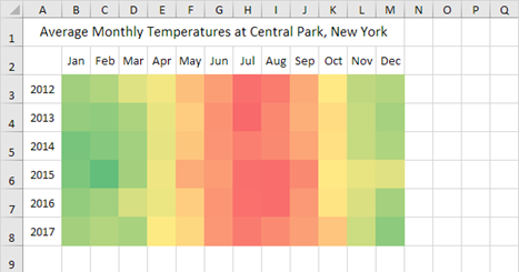
3) Heat Map: A heat map is a two-dimensional representation of data in which values are represented by colors i.e. it shows the relationship between two factors.
Example:
• Segment analysis of the target market
• Sales lead by an individual representative
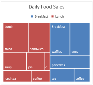
4) TreeMap: It shows the hierarchy of data as a proportion of a whole.
Example:
• Storage usage across a hard drive
• Comparing profit within different product lines
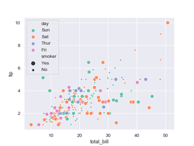
5) Scatter plot: It helps in investigating the relationship between quantitative values
Example:
• Non-technical vs Technical applying for an entrance exam
• Female vs male likelihood of having cancer
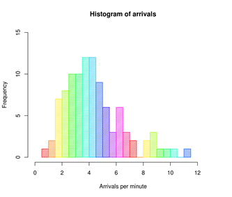
6) Histogram: It helps us to understand the distribution of data and helps in finding outliers
Example:
• Number of customers by company size
• Score of students
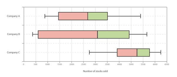
7) Box and Whiskers: It displays the Five Number Summary of the data. They are minimum, first quartile, median, third quartile, and maximum.
Example:
• Understanding the data at a glance and seeing if the data is skewed towards one end and identifying outliers.
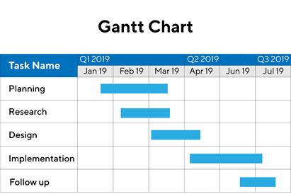
8) Gantt Chart: It shows the duration of the process over time.
Example:
• Project Duration
• Duration of the machine’s use
I hope the answer is helpful and clear your doubts.
Thank You
2 Likes